6 Great Tips On How To Create Artwork for T-Shirt Printing
By Jacob Cass / Recently I have been posting about sweet t-shirt designs (here & here) so I thought this would be a good time to share this guest article. Blake will guide us through some tips for preparing artwork for T-Shirt printing.
As many of you probably already know, doing graphic design, and doing graphic design specifically for t-shirt printing can be two totally different beasts. Have you ever worked extremely hard for long hours on a t-shirt design for yourself or a client, only to have the printer tell you that your design won’t work for t-shirt printing? This problem is not that uncommon and I would like to provide you with a few easy tips on how to prepare your artwork for printing on t-shirts.
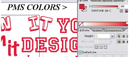
1. Use PMS Colors in Your Artwork
You may typically do artwork in RGB and CMYK color modes, but to ensure the most accurate colors with a silk screener, definitely use PMS colors in your artwork. This also makes the colour separations a lot easier and more accurate. Here is a link on how to work with Pantone in Illustrator.
On a side note, the printer should not charge you extra for PMS color matching. That is an old fashion way to get more money because you are actually doing them a favour by being more particular for accuracy.

2. Convert All of Your Text to Outlines
Sometimes your artwork may call for a very obscure font or maybe even a custom designed font. When sending your artwork off for print, the last thing you want to to see, is a substituted font in your design. By converting the text to outlines, any computer that opens the artwork will view the text as an image. Therefore, no substitutions will be made.
To convert text to outlines right click on the text with the selection tool and then click Create Outlines.
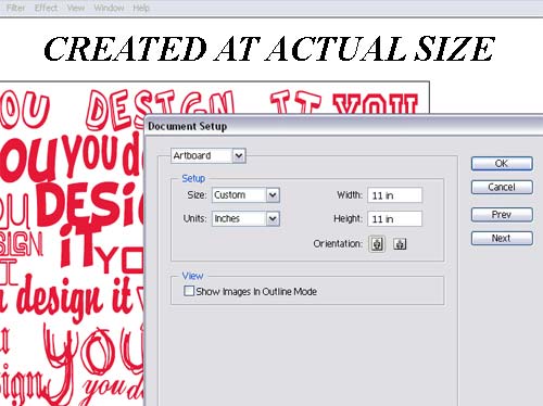
3. Create Your Artwork at Actual Size
Do not trust the printer’s judgment without discussing it with them first. I am a printer… so why would I say that? Because the vision you have of the end product can be very different than what the printer has assumed as your vision. The safest way to defend yourself in this situation is to create the artwork in its final size. Don’t know what size you want to use? Slap a ruler to the shirt you are wearing. Sounds simple, but it works.
You can set the artwork size in the Document Setup menu, found under File.

4. Use Vector Artwork As Much As Possible
This is not an argument over raster versus vector, just more of a suggestion to use vector artwork when possible. It makes colour separations easier and the print comes out cleaner in the small details. This is a general rule for the everyday jobs and not an automatic in all situations.
5. Expand Your Strokes
If you have properly set all of your colors to PMS swatches, then the color separations software will have no problem. This is more of a human error that occurs because sometimes strokes are overlooked. I put this tip at #5 because it is one that can save you from a small mistake ruining an otherwise great project.
To expand your strokes select what you want to expand then go to Object > Expand.
6. Set Your Half-Tones with PMS Colors
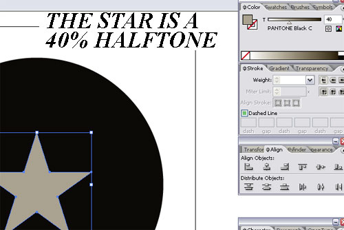
This one goes along with Tip #1. Sometimes your design and/or budget may call for the use of halftones to save on the amount of colours printed. The best way to do this is to slide the colour scale down to a percentage of the PMS colour. The colour separations software used by the printer should handle the rest.
In the image below, notice in the top right corner, the number 40? Usually that is 100%. Change it to 40% to set a 40% half tone.

These six great tips on how to prepare your t-shirt design for printing should cover the majority of the problems you might face. This kind of preparation should ensure a faster turnaround time and a much more accurate print.
Article Source: http://justcreative.com/2008/12/04/how-to-prepare-t-shorts-for-printing/


Comments are closed.